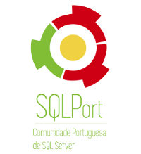
 After almost 5 years of existence, SQLPort (Portuguese PASS Chapter in Lisbon) is kicking of 2015 with a renewed image and with a lot of new projects that we are targeting to develop in the future.
For years we have used Portuguese Flag joined together with PASS logo, but after enough discussions we have decided to hire a professional who will help us develop an image for the community that will correspond our identity, that will tell the real story behind our mission and objectives and will help us in the mission of Microsoft Data Platform promotion between anyone interested in it.
Created by the amazing, wonderful – one & only DD (aka Diana David), this is the logo that we have been wishing for years. :)
So what does this logo represent to us actually ?
We see 3 people joining hands together (this is what community is about – helping each other),
We see green(new stuff) sharing with the red (old stuff),
We see green(novice) being welcomed by the red (experienced),
We see a target (we want to lead people forward to better knowledge and understanding, so you need to target us),
We see magnifying glass (we shall help you understanding and focusing on the most important content),
We see a fusion mechanism (we are innovating),
We see so many interesting and intriguing things in it.
and you might even recognise the similarity between our colors used in the logo and the colors of the Portuguese Flag :)
This is just the beginning of some major changes in SQLPort, stay tuned – cause 2015 is the year of SQLPort in Portugal.
Great logo and SQL Port deserves it!
I’m looking forward to know what are the other changes!
Best regards,
Pedro Ferreira
Pedro, obrigado! :)
Um abraço,
Niko