This is the second blog post in the series dedicated to the Network Graph Analysis Tool – NodeXL.
If you are interested, you may find the very first post at the first blog post of the NodeXL series.
In this blog post I will show to get started with NodeXL.
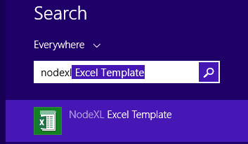 After downloading and installing NodeXL, you will need to open the NodeXL Template File – this is the only way how you can start using NodeXL, because it is not installing itself as a formal Excel plugin, so you don’t need to go to Excel options and playing with Add-in settings.
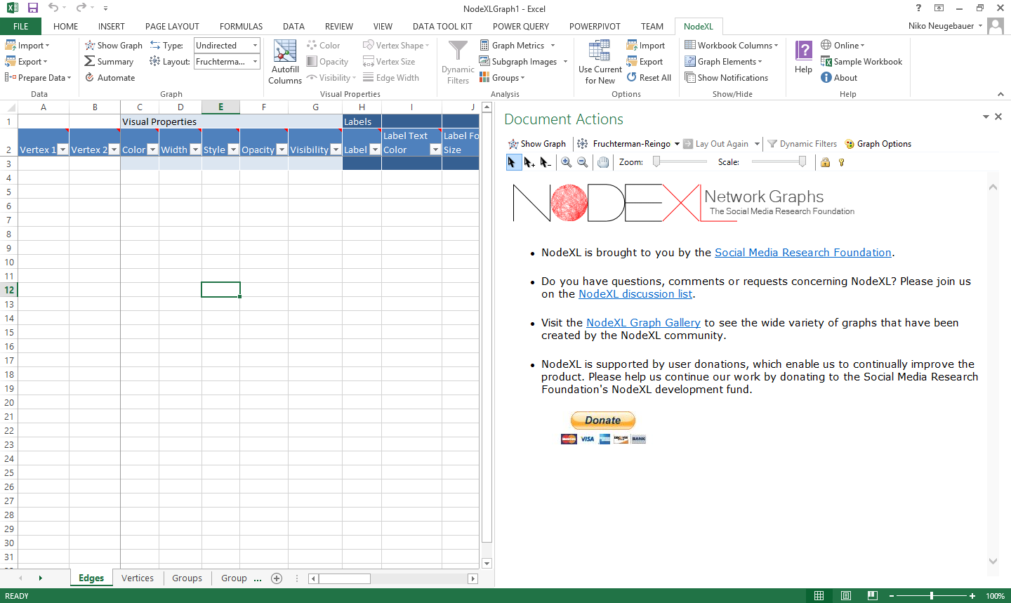 First thing you will notice is that you have a new NodeXL ribbon added to your Excel ribbons. After selecting it, you will find out that NodeXL working area consists of 3 main panels:
– Menu (menu is a menu :))
– Information Panel (a typical, pre-formatted Excel worksheets)
– Document Actions Panel (Visualisation)
Note that those are quite unofficial names, but I am used to them :)
Menu
Data:
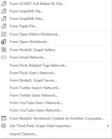 The starting point of any Data Analysis is naturally an import operation. At the top level corner of the NodeXL ribbon you will find Import button. You can easily see a number of options that are available for direct usage: Flickr, Youtube, Twitter, Email Network, GraphML file, etc.
Important to note that under “Get Third-Party Graph Data Importers” option you will find a number of very useful and important plugins that must be downloaded and installed separately. Between those plugins you have Social Networks (Facebook), MediaWiki and Exchange Server for example.
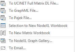 For exporting data there is a Export Button. It will allow the export into GraphML formatted file, Pajek File and other options. One of the most import options here to be found is “Export Selection to New NodeXL Workbook”, which will basically allow you to zoom into one of the sub-areas of your graph. This is a kind of a drill-down option that value becomes more clear the more complex networks you are analysing.
One more cool option for the export is to export your file directly into the NodeXL Graph Gallery, I have mentioned in the first blog post on NodeXL.
Button “Prepare Data” allows you to count & merge duplicate edges (very useful in some situations) and to Get Vertices from Edge Worksheet.
Graph:
After that the Main Menu consists of almost all practical options that you will be using while working with NodeXL:
Refresh Graph at the Document Actions Panel,
Summary which gives you the detail on the options used to generate the graph,
Automate – for any IT person a very clear indication of where to look when improving the time spent working on the repetitive actions,
Type – directed or undirected (it would depend on the network you are working with), Layout this is where you select the type of your visualisation layout and define its options,
Autofill Columns – an option which will allow you to customise the network information & visualisation, based on the imported data (more on this option is coming soon)
Color,Opacity,Visibility,Vertex Shape,Vertex Size,Edge Width – options to control the visual presentation of a Vertex;
Analysis:
Dynamic Filter – this option allows one to filter data (Vertices) based on a number of dynamic criteria. There will be a blog post in the future describing this feature in detail.
Graph Metrics – allows to select and calculate such Graph Metrics as Betweenness Centrality, Clustering Coefficient and Page Rank for example. This is a highly analytical functionality of NodeXL and its usage will allow to extract real numerical value out of your data.
Subgraph Images – an option which will allow to create small images for each of the Vertices, containing its own sub-graph. One can define the maximum number & type of connections to be included in it. Can be extremely useful for a better picture of what is going on.
Groups – one of the most important options, which allow to group Vertices based on different criteria and closeting algorithms. We can even add Vertices to some specific groups manually. Awesome!
Options
Use Current for New, Import, Export & Reset All allow you to save you current visualisation customisation, export it and share with your friends and colleagues.
Show/Hide
This buttons allow you a more precise control of the Workbook data options, such as Workbook Columns.
Help
A number of help options, explore them if stuck!
Workbook
 A typical NodeXL workbook consists of multiple worksheets. The most basic that one will have by default are: Edges, Vertices, Groups, Group Vertices & Overall Metrics.
Edges worksheet: – This is basically a collection of all recorded relationships between different edges in our data set. We have a Vertice1 & Vertice2 columns which contain the names of our Vertices, and after them we have a set of columns which are containing additional data about their relationship, plus all possible visual options and labels, such as Color, Width, Style, Opacity, etc.
Vertices worksheet: – here we have all the vertices determined from the Edges worksheet. Besides the name of the Vertice we have a similar subset of the visual properties and labels. “Other Columns” will incorporate specific data imported from the Data Source.
Groups worksheet: – this worksheet allow us to manage data of the grouped vertices. By default it is empty, but once we activate the Groups, we should have there Group Name, Visual Properties (as in other worksheets), Labels;
Group Vertices worksheet: – on this worksheet we have a list of all the vertices and their relationship to the specific Group defined in a previous item;
Overall Metrics worksheet: – on those cells one could find the calculated metrics defined and selected at the menu. They should give us information that will help us in our decision making process.
Overall do not forget that this panel is just a set of worksheets like any other Excel files. You can explore them, sort by any columns for your own analytical purposes and of course edit that information.
Document Actions Panel
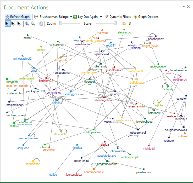 This is where the magic happens. :) An extremely fast (in my opinion) visualisation panel which allows you to explore the visualisation data. You can zoom in & out, select and edit(add & remove to selection) the Vertices while seeing them being selected at the Informational Panel where all worksheets are located, you can edit graphic options, select one of the different layout algorithms and define its options, use Dynamic Filters (see above at the Menu Panel description), etc.
The number of different layouts is very nice, we have a Fruchterman-Reingold, Harel-Koren Fast Multiscale, Circle, Spiral, Grid, Polar and many other very distinctive and useful layout algorithms. I found the choice to be excellent and quite sufficient, but than again I am not using NodeXL on daily basis… :)
We can Lock/Unlock specific vertices for a better analysis, we can drag and drop them by using a mouse, and most of all we can simply explore the data in order to find patterns, identify logic and determine the type of the network we are dealing with.
I will be exploring the real life examples in the very next blog post of this series, stay tuned! :)
to be continued with NodeXL – Accessible Network Graph Analysis, part 3: Creating a beautiful visualisation under 2 min with Twitter Data