Almost one year later, after the original Portwatch research, i have decided to do one more research, this time dedicated to the standard compliance (and not compliance) of the portuguese banks.
I am expecting to be able to conduct a new research dedicated to the principal portuguese municipalities later this year, just to be able to compare if there is any progress, but i also wish to compare other “industries” and governmental authorities, so i am going to include them all into Portwatch or whatever name this project will shape into in the nearest future.
I have visited websites of 9 biggest portuguese banks, to compare their standards compliance, to test their sites in 3 major browsers – Internet Explorer, Mozilla Firefox and Opera, and to know if there is at least one bank who cares about their customers with special needs. The banks i have chosen to test are: Banif, Barclays, BES, BPI, CGD, Deutsche Bank, Millenium BCP, Montepio and Totta, as the others only make part of these ones, or their impact is really insignificant for 99% of the portuguese bank customers.
For this research, i have basically reused the definitions used for the original portwatch, but made some slight modifications, as i saw them necessary, such as adding web feeds as a criteria or removing the part related to foreign languages, for example, or redistributing the number of points for other categories. But moving away from the declarations, i better start with the research itself, so here it goes:
Research statistics:
- 33% websites were using document types, and all of the document types were transitional – it seems that standards has not reached the bank universe in portugal yet, as the most of them who used, did it by occasion, in my opinion
- 11% of the research sites (which is exactly one site) have table-less design, which is quite a sad result, thinking about the investments that banks supposedly do to improve the quality of their internet presentation
- 67% of the sites were using favorite icons
- No bank has used any web feed, and it is quite surprising, since i thought that the banks were those, interested in providing their clients with some useful financial information (even for money subscription). That shows that the portuguese banks websites are underdeveloped.
- No valid xHTML or CSS were found between all those sites, and sadly it is not a big surprise.
- WCAG as usually are largely ignored by vast majority, and once again Totta has had a positiver result here.
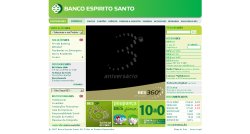
Banco Espirito Santo features a very well implemented structure with a lot of javascripts, which is without any doubt set one of the best examples of the quality work in the sense of representing and functioning correctly in the most of major browsers available, but at the same time is a negative example of ignoring the most if not all standards. At this moment i am unable to test their site in Safari, but hopefully later this year i am going to publish an update to this article, including it as well. BES site uses a typical minimalistic design, which so popular lately, and can be seen on quite a number of pages of other portuguese banks as well.
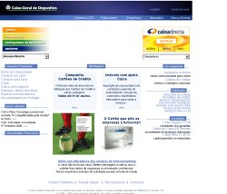
CGD site has some minor glitches in Firefox like links collection on the right side, for example, but as for the rest the site is more or less consistent, if not talking about visual design and usability part, cause it is a very different topic, in which Caixa’s site wont be able to get a lot of points.

Montepio’s site has a minimalistic design as well as a minimalistic implementation. I would like to ask the responsible for the implementation of the main menu what he/she was thinking while doing the work – it is extremely irritating to pass with the mouse over the menus, because they appear not exactly at the place where one would expect them to appear, and no, it is not an effect in a browser, as i have tested it in most of them. Especial note should go to the Opera’s menu presentation – it is a blank to fill by the developers, hopefully.
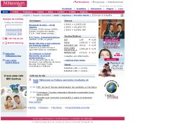
Millenium BCP has a remarkable result when validating by W3’s markup validation services, it displays a message “Sorry! This document can not be checked.” This message follows a very big list of lines, which contained not understandable symbols. This made me think and wonder about accessibility, As a notice, Millenium BCP site was one of the few sites, which has not passed even 1st priority WCAG 1 requirements, but at the same represented good functionality on the level of the major browsers.
Totta has the most sympathic site of all portugues banks. For me, it was a real pleasure navigating through its pages, when comparing to the rest of the stack. No table-based design speaks about modern web developers and designers working on this project, WCAG‘s 2nd requirement was implemented successfully, swift functioning in all major browsers, what one could have wished for a business site today ? Maybe finally closing some of the items (34 errors as of the moment of testing), using RSS for a news, but lets hope that next year this is going to change for better.
Interesting, that Tottas site is one of the three of the tested sites, which has not featured “favorite icon”, but that does not influence the result on a bigger scale as their performance were more then 100% better then of any other portuguese bank.
The most interesting thing about Banif’s site, is that it reloads automatically the page after any browser window resizment, which annoys me a lot i have to add on a personal side. Its not it seems that their site was made by the people who hate usability and learn marketing from the yellow papers, but the fact that the most of the things in it just telling a user to back off – things like flash animation which is not working in Firefox (was it so hard to put the things right to make it work?), like the fact that about 75% of the space is dedicated to the self-promotion, like that menu links do not have a hover status and menu arrows do not have any hover status at all, like using an envelope for finding the nearest location (instead of the contact). The design of Banif’s site is fine, but its implementation is something really horrible, and should be removed and re-implemented since the beginning by someone who understands what he is doing.
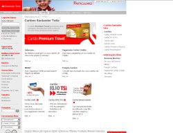
Barclay’s site is a good example of an old style web design implementation, as it is not following modern standards and technics, but at the same time it delivers the message, using a good visual design, and it works in the major browsers without any major error. There is no need to compare this site with their parent organization site in England, as those 2 sites has nothing to do with each other, as the one in England has a much more reasonable implementation, and if the portuguese subsidiary would follow them, barclays portugal would definitely be somewhere between the best, and even may be competing with Totta for the crown.
One of the first things to notice on the BPI’s site is that it was optimized for Internet Explorer 5.x and resolution 800×600, where x stands for “Xtremly kool” or “extremely old”, whatever you prefer and the resolution is fixed so even if you have a better resolution on your monitor, you are tied to that inflexible design. Design done by someone, who definitely dislikes making websites, as the main navigation has no hover status, and the most of the links have no underlining, as saying “don’t go there, there is nothing interesting for you”. This advice applies especially for those, using Opera browser, as the site is completely broken in it. On the good site, one thing to notice is the presence of the DTD, which is a kind of rare thing for the portuguese websites.

Deutsche Bank has a passion for the dropdown(combobox) menus, and it is not a very common one, though i admit finding it reasonably usable way of representing site structure. Interesting is for example when having a resolution beyond 1024×768 pixels and resizing browsers window to 1024×768 in Firefox one will notice a horizontal scorllbar appearing on the bottom of the browser. This is just an error in implementation, as it maintains everything correctly in the same conditions in Internet Explorer. Deutsche Bank’s site was the only one without an icon, which is a minor, thing though helping users visualy identify their bookmarks later.
| Frames | Use Tables | Doctype | Valid HTML | Valid CSS | Min Resolution | Fav Icon | Browsers | RSS/Atom | WCAG | Bonus | Total | ||
|---|---|---|---|---|---|---|---|---|---|---|---|---|---|
| Banif | 5 | 0 | 0 | 0 | 0 | 3 | 0 | 5 | 0 | 0 | 0 | 13 | |
| Barclays | 5 | 0 | 0 | 0 | 0 | 6 | 1 | 9 | 0 | 0 | 0 | 21 | |
| BES | 5 | 0 | 0 | 0 | 0 | 3 | 1 | 9 | 0 | 0 | 0 | 18 | |
| BPI | 5 | 0 | 1 | 0 | 0 | 6 | 1 | 7 | 0 | 0 | 0 | 20 | |
| CGD | 5 | 0 | 0 | 0 | 0 | 6 | 1 | 8 | 0 | 0 | 0 | 20 | |
| Deutsche Bank | 5 | 0 | 0 | 0 | 0 | 3 | 0 | 9 | 0 | 0 | 0 | 17 | |
| Millenium | 5 | 0 | 1 | 0 | 0 | 6 | 1 | 9 | 0 | 0 | 0 | 22 | |
| Montepio | 5 | 0 | 0 | 0 | 0 | 6 | 1 | 5 | 0 | 0 | 0 | 17 | |
| Totta | 5 | 10 | 1 | 0 | 0 | 6 | 0 | 9 | 0 | 20 | 0 | 51 | |
| no bonuses were added at this time | |||||||||||||
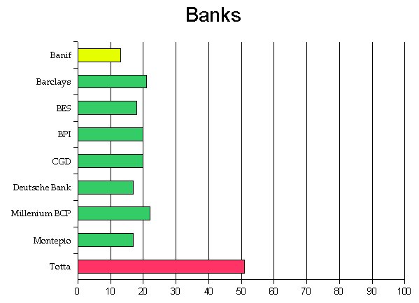
Conclusion: besides Totta, there is no portuguese bank out there, who has a minimum interest in supporting standards and people with special requirements, but even Totta has no idea about what web feeds is or what it is used for, since it appears that every bank is expecting their customers to come daily to their sometimes heavy pages to get some news. The most banks are still “living” outside of the technological age in that sense, but at the same time, they have shown some care about their users, since the most pages are usable practically in every major web browser available, but the questions stays – for how much time, since new versions are coming steadily each after another, and i don’t think that it is a wise investment by adapting each and every page to a newer version, since there is an alternative – following the web standards.
Is there a Caixa Geral Depositos in RI or Massachusetts?